So that paint job is how an airline was branded, and would be obvious to a flyer as to whose plane is was. American Airlines had an obvious one. They weren't painted. They had their bare aluminum skin.
I was thinking about my favorite liveries, so decided to make a blog post about it. In reviewing some, I think in general I like stripes across the windows, airline name above the windows. The wrong logos on the tail, I'm not a fan of either. While not a list in order, I'll start with some I don't like.
Here is one from now defunct PeoplExpress. An upstart after airline deregulation, they eventually went under. I don't like the brown, the highlighted windows, or that lame logo on the tail.
I don't like the airline name wide across the body. The Polish airline LOT has always done that. Northwest did it for awhile too.
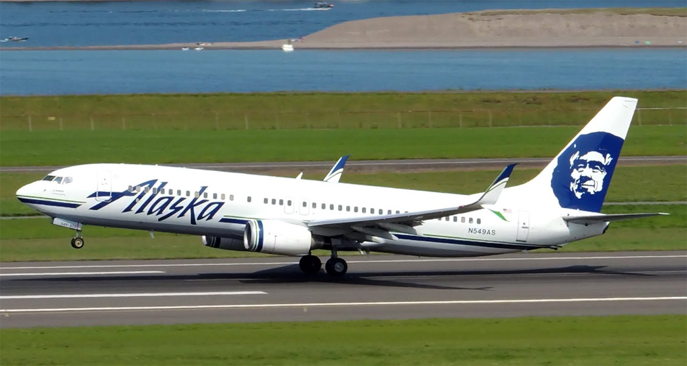
And I'm just not a fan of the Eskimo on the tail of Alaska Air. It also has the airline name big across the body, so if one has to be chosen as my least favorite livery, this is it.
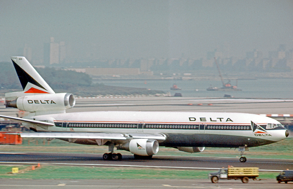
So on to my favorites. And in pondering, maybe I'm just nostalgic, but every livery I've chosen is no longer in use. In positions 4 & 5, the airline is still operating, they just look different now. My gold, silver, and bronze are all defunct airlines. So without further ado, coming in at #5 most favorite livery is the 1980s Delta Airlines. Here's a Delta DC-10. It has the stripe across the middle, the swept back airline name, and the tail adds some character without being too flashy. I never flew Delta when this was their livery, but I always liked the look. Bonus for the black nose cone too.Coming in at #4 is the 80s/90s United Airlines with the "tulip tail". United has changed their livery over the years probably more than anyone. And they've never had a bad one. Of current liveries, I think they have the best one. On their tail is a nod to Continental Airlines, and their logo, after United took over Continental. So anyway, below is a 80s 737, and then as an added bonus, a 737 with their current livery.
Coming in at #3 and #2 are similar. At #3 TWA, and #2 PanAm. TWA is now a part of American, and I think Pan Am just kinda went under. I flew on TWA some, and never flew on PanAm. But they, to me, were the classy international airlines. If I ever had a chance to go to Rome or Prague or Cairo, it was going to be on TWA or PanAm. Now my experience on TWA was flying to Sioux City and not Rome. But in any case, I think I looked good doing it. TWA went thru some different liveries over the years, but I liked the version with the red block "Trans World", and the black under the windshield. A TWA 747 was just a bad ass jet. As for PanAm, I really liked the 60s and 70s look. White with blue and their recognizable logo on the tail. I include a photo of the 707, the first and best international travel jet--which was also on the the main characters in the movie Airport.
Now for my winner. North Central Airlines. North Central ended in the early 80s after merging with Republic, who merged with Northwest, who merged with Delta. Never had a chance to fly them. But I recall a trip my parents took me to the Minneapolis Airport, and with North Central headquartered there, there were plenty of those planes to look at. I remember seeing them on a trip to the Sioux City Airport as well, as a kid. I think their teal and silver look sharp, and their font on "North Central". They also had a distinctive logo on the tail. It even had a name, Herman the Duck. So here is a Convair 580 (I got to fly on one of those a few times-curtains in the windows even), their DC-9, and even an promo film for them.
So wahat airline livery to you like?


(Grd)(CVC)(46)-L.jpg)

No comments:
Post a Comment